
My First WWDC Above: Apple’s live App Store wall at WWDC. It showed icons of 20,000 iPhone apps,…
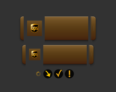
When I started the Delivery Status widget it didn’t support many services. I wanted each service to be visually distinct, so I created entirely separate graphics for each one. It was sensible at the time, but as I started adding more services it turned into a hassle. Each service was four separate graphics (left, middle, right, and logo) for each size (small and large) plus another for the Growl notification, making nine total. Some had to be customized further with their own status icons (loading, in transit, delivered check mark, and error).
That’s a lot of graphics for just one service! Whenever I added a new service it was often more work to create the graphics than it was to write the code. The iPhone app added another graphic I needed to create for each one.
I couldn’t do the backgrounds with CSS alone because it’d look very flat. I didn’t want to lose the subtle gradient or beveled edge. Transparent PNGs are a great solution to problems like this though: I could have a flat color in the background, and put a transparent graphic on top with just the shadows and highlights. Perfect!
Well, almost. Some of the services are lighter colors and some are darker. On the lighter ones the shadows needed to be lighter and the highlights needed to be brighter. On the darker ones it was the opposite. And there are some that fall in between. With this new approach, a few of the services looked great and a lot of them looked awful.
If I separated the shadows and highlights, then I could control the opacity of each separately. The light colors could have brighter highlights, and the dark colors could have darker shadows. They all need the same drop shadow, so that was another layer. (I tried to do the drop shadow with CSS, but the rounded corners looked awful.)
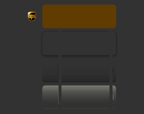
This looks more complicated—and in a way it is—but it’s much simpler to update. The brown box is done entirely with CSS, I just pick a color. Adjusting the shadows and highlights is done by changing two numbers. Most of the services now have a single logo graphic that’s scaled up or down for the two widget sizes. The CSS used to set the whole thing up is more complicated, but the CSS unique to each service is much simpler.
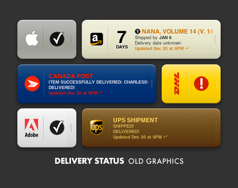
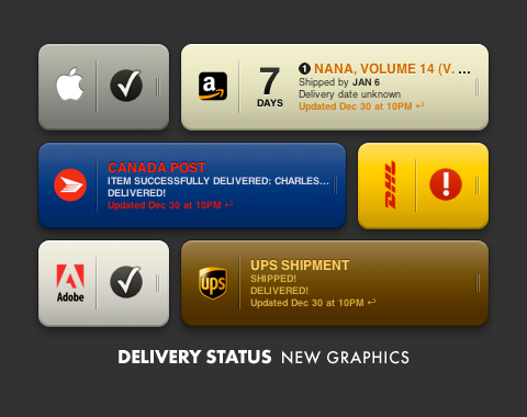
The new system isn’t just easier to set up, it’s also much faster to tweak. As a result I think the different services have a much more unified appearance now. With the old graphics I always though some looked a bit flatter than others, but redoing all those graphics would have been a huge amount of work.
In the future, CSS gradients or CSS masks could simplify the process even further, or allow more exact control. Can’t wait for this stuff!
You should see the results of these changes in Delivery Status 4.6 and Delivery Status touch 2.1. Both are in beta testing now, and we’re hoping to release them in the next week. Aside from the new graphics system, we’ve also added support for City Link in the UK and Yamato Transport in Japan. We’ve fixed the FedEx problem that came up yesterday as well, and made a lot of other improvements!
My First WWDC Above: Apple’s live App Store wall at WWDC. It showed icons of 20,000 iPhone apps,…

Business Cards My new business cards finally showed up today, and they look awesome. Same as with…

Welcome to Junecloud! When I first started running my own business full time a few years back, I really…

Delivery Status touch icon Above you can see how the Delivery Status icon progressed from sketch to finished…
Comments
This entry has 6 comments.
OwlBoy wrote on January 19, 2009:
Looking great. And I bet this lowers the file size for the overall widget a bit too since the unique parts are tiny.
FJ de Kermadec wrote on January 19, 2009:
A great perspective on design problems, for a stellar result.
I like the way you managed to rationalise the design of the various status indicators and turn them into a system. As you point out, a little bit of complexity at the start to “seed” the system makes for a whole that is slimmer and easier to manage as time goes by.
On a side note, the new designs also look crisper and more Leopard-like, which further improves on a terrific concept.
Julian Schrader wrote on January 19, 2009:
Very nice—just like #2, I like the new concept as well as the improved style :-)
Rasmus wrote on February 5, 2009:
Multistep transparency FTW! But I do like the old graphics better than the new one. The older was easier to read (and too much shades-of-web-2.0-a-la-2007 for my taste).
rdas7 wrote on February 25, 2009:
Looks fantastic! Thanks for posting the details of your changes, too. It may sound trivial, but to other developers, like myself, it’s great to see examples of how to tackle problems.
Your widget & iPhone app are simply some of the best out there. I recommend them to everyone!
ChabrellIgan wrote on April 22, 2009:
God dag! Kan jag ladda ner en bild fran din blogg. Av sak med hanvisning till din webbplats!